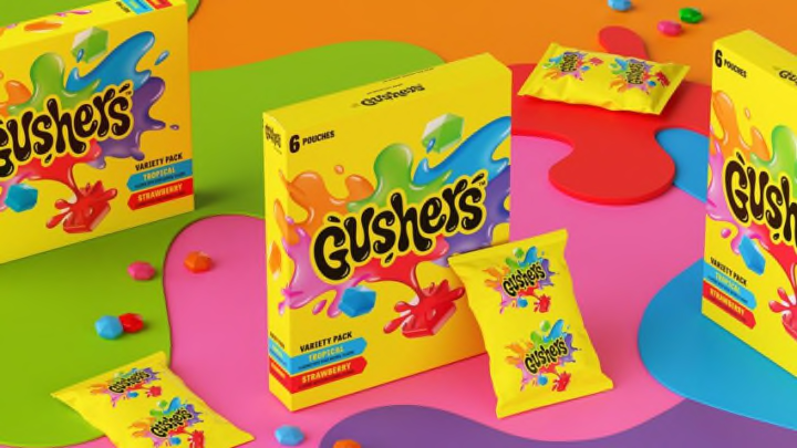
Over the past several years, certain brands have seen a resurgence in popularity. One reason is consumers hitting a certain age and feeling nostalgic. Another reason is that certain brands are finding a new audience. While there can be something said for a retro feel, brands need to modernize to stay relevant. With Gushers and Fruit by the Foot, General Mills gave the brands’ looks a glow up and it has many people doing a double take at the new packaging.
Changing an iconic product always gets a response from consumers. Looking through food history, there have been moments that in hindsight had both positive and unfortunate consequences. Sometimes that “new” cola has people remembering why the “classic” should never go out of style.
With the new imaging revamp of both Gushers and Fruit by the Foot, the change is more than a new font and a bolder color scheme. The idea is to capture the feeling of eating enjoyment associated with the product.
Speaking to the changes, Ashley Berset, General Mills Brand Experience Sr. Planner, said that the Gushers’ design was ready for some changes. While the snack brand has sought “to defy norms and unleash what’s on the inside,” that exhilarating feeling needed to be showcased on the box.
Although some people will always appreciate the classic image, the new Gushers have a vibrancy. The multiple colors capture the fun and interactive feeling that happens when eating the food. Even the font brings that feeling of excitement and fun when biting into the snack.

Berset explained that this visual concept puts that is unique about the brand front and center. It is about showcasing the importance of a multi-sensory world. While there is an element that makes this idea appealable to teen engagement, it goes beyond just one segment. More importantly, it hopes to build a brand loyalty.
The Fruit by the Foot takes a similar approach. Given that this food is about the engagement of rolling out the fruit leather that imagery can be seen on the package. It invites the consumer to open a package and go on that flavor adventure. From color to flavor to even texture, it is about taking the next step.
Now that General Mills has revealed these two rebrands, the question becomes how balancing nostalgia and innovation can go hand in hand. While the eating experience that people remember has not disappeared, the new look invites people to try again or, for some, try for the first time. Ready to open a package, smile a little more brightly, and remember how food can be fun?
