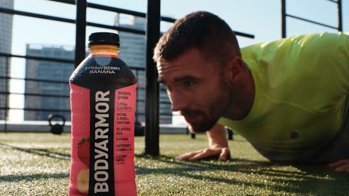
While water might be the simplest beverage to boost hydration, consumers want more than just a refreshing drink from a spring. Functional hydration fits within a person’s overall lifestyle. As Bodyarmor debuted a new look, the Coca-Cola beverage brand chose to highlight its core concepts while setting itself apart from its competitors.
Over the years, Bodyarmor has sought to be different from other functional hydration choices. While some sports drinks are the centerpiece of victory celebrations and other brands are associated with pop culture celebrities, the reality is that choosing one beverage over another should come down to taste and function.
While the Coca-Cola beverage brand has used limited edition flavors and collaborations to bring some excitement to the bottle, this rebrand is more than just new labels and clearer identifiers. It is a decision to showcase what makes Bodyarmor unique.
At the core of its offerings, Bodyarmor highlights natural flavors, coconut water, vitamins, and electrolytes. Labels that clearly identify those elements allow consumers to make well-informed decisions. Transparency is a vital component in consumer trust and loyalty.
As part of the rebrand launch, Sabrina Niland, VP of innovation at Bodyarmor, graciously answered some questions for FoodSided. While it is vital for food and beverage brands to stand out on the shelf, it is more than just a new color scheme or a bolder font. Consumers need to resonate with the concept behind the new look.
When asked about Bodyarmor’s identity, its target audience, and adapting to a lifestyle concept, Niland looked at the big picture. Standing out on the shelf cannot be gimmick. When the direction resonates, consumers will be drawn to that authenticity.
Niland said, “The world of functional hydration is constantly evolving and changing. Since Bodyarmor entered the category, the marketplace has gotten more crowded, and consumer preferences and habits have changed along the way. Despite these obstacles, Bodyarmor has stayed true to its brand promises and refused to compromise on no artificial flavors, sweeteners or dyes, more electrolytes, and great taste. It’s these defining characteristics that have helped us stand out from the competition, while also appealing to a mass audience.”
The brand’s concept has never waivered. Niland continued, “What Bodyarmor has stood for since day one, aligns with the way consumer preferences have shifted in recent years. We’ve seen more consumers than ever before reading labels, becoming more thoughtful about ingredients and paying close attention to what they’re putting into their bodies. Functionality has also started to rise in priority. Our new visual ID prioritizes what consumers care about - putting our money where our mouth is by putting our ingredients proudly on the front of pack. We’re very excited to see it in the market.”

As consumers become acquainted with this new look, Bodyarmor never wants to lose sight of its loyal fan. Niland explained, “Bodyarmor has established its unique loyal customer base across a variety of demographics. Our goal for the new visual identity is to increase brand awareness and drive trial more than ever before. By bringing boldness and energy back to the traditional sports drink category, we expect to bring in new fans to our already existing loyal customer base.”
While the core beverages did not get a new flavor profile or change the successful formulation, the change in packaging is important to consumers. Just like some people prefer a slim can or a colorful label can draw the eye, Bodyarmor was clear in its rebranding approach.
Niland explained, “In developing the new packaging, we analyzed a variety of elements. From this, we landed on the new pack that features a bold, vibrant color palette, photography of real fruit to enhance refreshing taste cues, and clear noting of product ingredients. Understanding what matters to our consumers was a crucial part of the process. We tested along the way and made tweaks based on feedback from real consumers, which is reflected in the latest new-vis. “
Bodyarmor is not the first beverage brand to take on a new look. As styles evolve, modernized looks keep the product fresh.
As Niland shared, “When looking for our products, consumers will notice how our wordmark is cleaner with a sharper serif typeface that is dynamic and precise. The new armor is simple and bold - inspired by gladiators, signaling fortitude against adversity. These elements all have come together to create a powerful shield – the new Bodyarmond brand icon that represents strength, protection and unity. With the new-vis, consumers will also be able to easily differentiate between our sub brands - black for Base, white for Zero and multicolored for Lyte.”
The bold and modern packaging is just one aspect to the Bodyarmor’s approach. While the look clearly communicates what the beverage company stands for, how, when, and where that drink is consumed matters, too.
Niland said that the brand thinks about how the beverage is drunk during the rebranding process. Stating, “Innovation has always been the foundation of Bodyarmor, which spans every element of the brand and product - from the formula itself to the packaging shape and label. Another area is how we can make the consumption process better for customers. Over the years we’ve fine-tuned bottle sizes and caps to address a consumer need. We’ve introduced new forms like powder sticks to make the product more portable & customizable. Everything is taken into account.”
As the new look rolls out to store shelves, new campaigns appear across platforms, and consumers react to the rebranding, one thing remains constant. Thoughtful ingredients paired with functional hydration will always quench a consumer’s thirst. This time, the bottle mimics those concepts with a bold, clearly defined style that will entice consumers to grab it off the shelf and choose better.
